Photography
RAPOLAS RIMAVIČIUS · PHOTO & INTERIORS · CALGARY · 2026 ·
Okos is a Calgary-based deployment partner for enterprise security — managing the full lifecycle of complex installations for integrators, from design and compliance to close-out, through a proprietary app.
Information architecture, component library, and copy were rebuilt from scratch. Palette: teal on dark navy. The dark ground communicates the operational weight of the work without leaning into surveillance aesthetics.
The redesign borrowed UI elements directly from the Okos platform and extended them onto the marketing surface. Website and product read as one system. Built in TypeScript.
Alongside the site, a technical proposal generator was built for the Okos sales team. Takes a bill of materials and scope of work document and produces a formatted technical proposal at the click of a button — using the Gemini API to generate system architecture overviews from input documents.

Remmlo was a direct-to-consumer orthopedic pillow brand — built to address neck and back pain through an innovative contour form, without ever looking medical or clinical.
Every consumer-facing surface was designed and produced from scratch: brand identity, Shopify storefront, product photography, and a full suite of ad creatives. There was no existing brand to work from.
The orthopedic sleep category defaults to white, clinical, utilitarian. The deliberate move was toward soft purple and lavender — medical-adjacent without being cold. Rounded type, rounded cards, rounded product form. Everything reinforcing one message: this will make you feel better.
A single-product store built on Shopify, structured around a clear conversion logic: establish the problem, introduce the product, build trust through comparison and social proof, close with an FAQ. The product page mirrors the homepage so the full funnel reads as one system.
Product and model photography was shot and directed in-house — leaning into softness, comfort, and lifestyle context rather than the clinical look common to the category, with lighting and colour graded to the brand palette.
A full suite of ad creatives produced for paid social — each asset targeting a different moment in the awareness funnel, from lifestyle-led brand awareness through to feature-specific conversion.
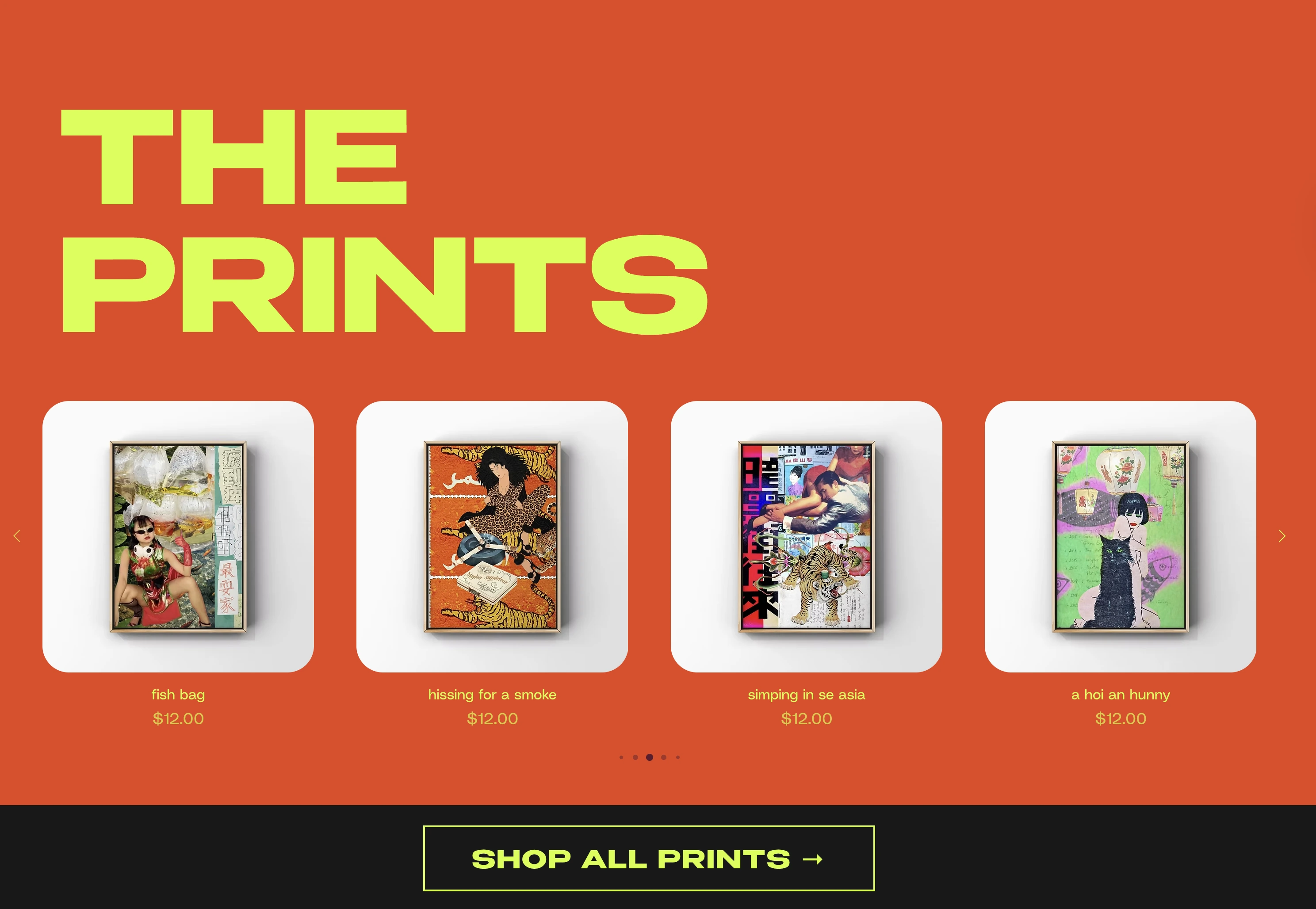
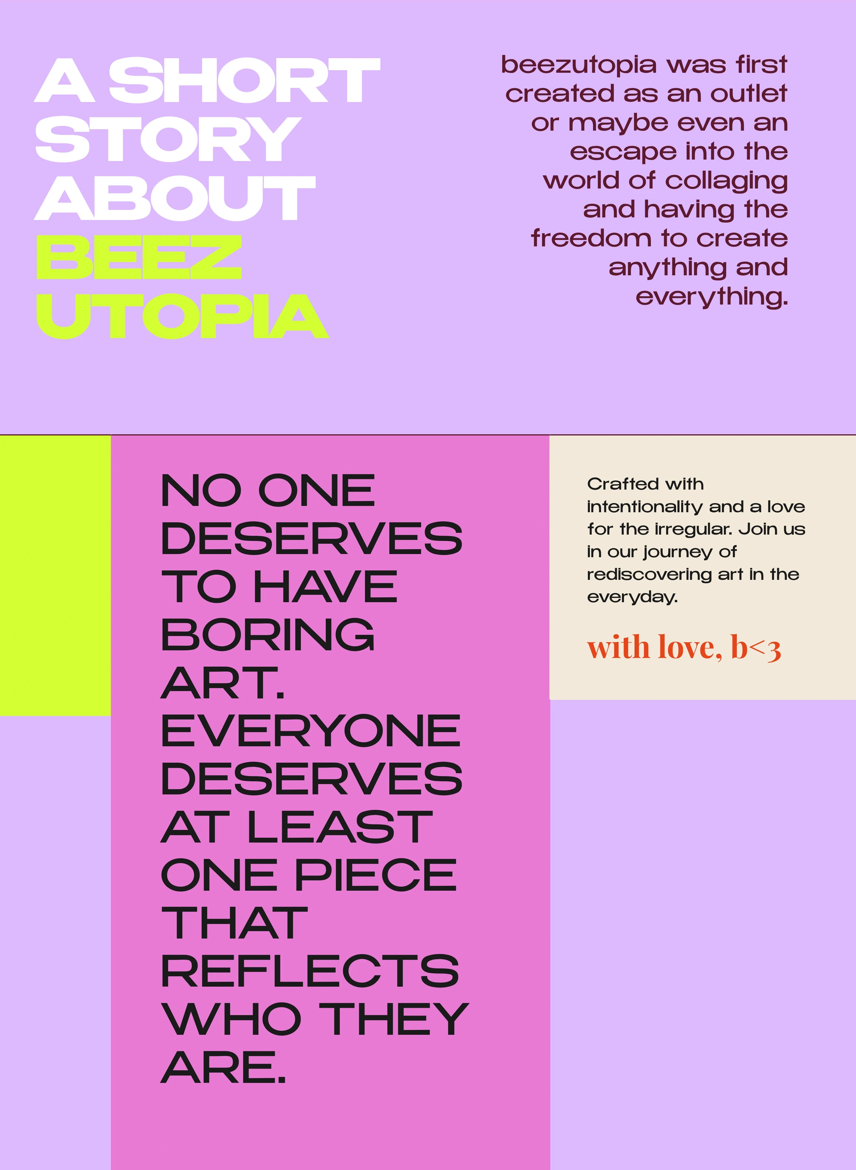
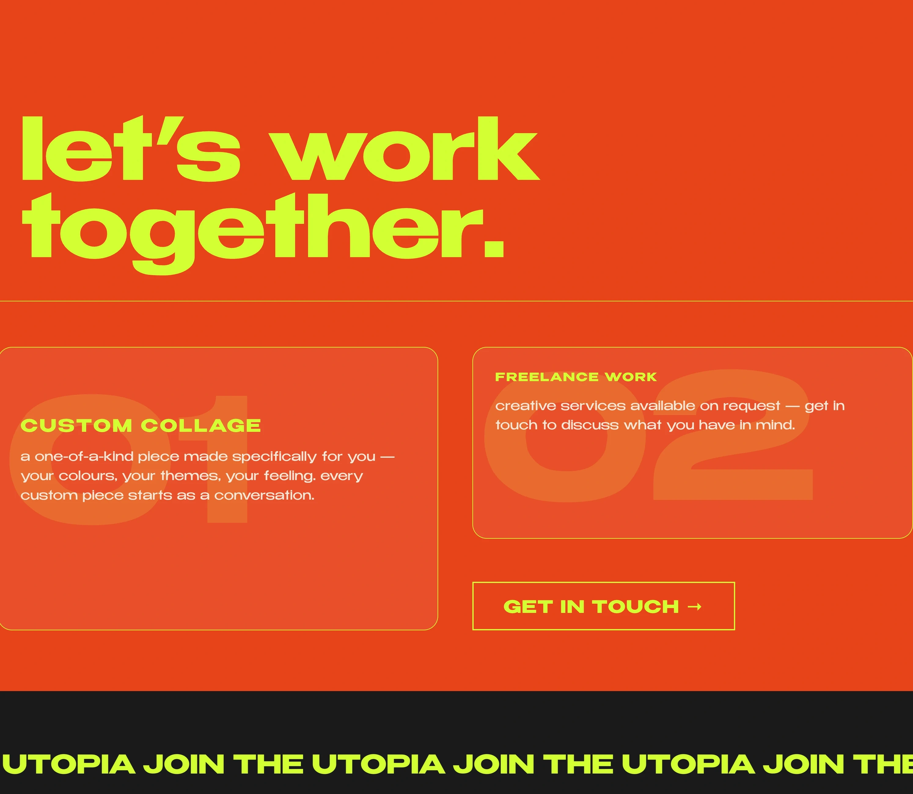
Beezutopia is a Calgary-based collage art practice — monthly classes, prints, and custom work, built around the idea that everyone deserves art that reflects who they are.
Full creative control over the site and visual identity. The brief: give a loud, personality-rich practice a clear hierarchy and strong entry points — legible, without flattening what makes it interesting.
A controlled four-colour system — neon yellow, purple, red, black — with bold, loud type on purpose. The layout borrows from editorial design: clear sections, strong entry points, nothing buried.
Structured around the two core offerings — the Collage Club and the print shop — with a clear hierarchy between them. The Collage Club leads as the recurring revenue and community anchor; prints and custom work follow. The full site reads as one system: a creative practice that knows what it is.
Brand systems, websites & photography.
Brand systems, websites, photography, and AI-built tools — built end to end for founders and small businesses. For clients who care about what things look like, and why.
Archive — smaller work and collateral: posters, one-pagers, identities, and the odd one-off.
A fuller selection is on the way. In the meantime, get in touch to see more.
Rapolas Rimavičius. Designer and photographer, originally from Vilnius, based in Calgary.
Working across brand, web, photography, and AI-built tools for founders and small businesses. For clients who care about what things look like and why.
Photography also lives at rimavision.com
Available for new work. rapolasrimavicius@gmail.com
Let's work together. Tell me a little about what you have in mind.
Received — thanks. I'll be in touch shortly.
Prefer email? rapolasrimavicius@gmail.com